Key Takeaways
- Halftoning is important for DTF printing to create smooth gradients and fading effects, which are difficult to achieve with solid ink.
- Semi-transparent pixels don’t print well in DTF so always use solid halftone dots.
- Tools like Kixxl can automate halftone conversion, making it easier to produce print-ready files with consistent, high-quality results.
- Proper Halftoning reduces ink buildup, resulting in softer hand feel, improved breathability, and longer-lasting designs that resist cracking and peeling.
Introduction
Though DTF printing is absolutely versatile and has totally transformed the custom apparel and print-on-demand businesses, it has a significant challenge: producing partial transparency effects, such as fades and soft shadows.
The solution, however, lies in Halftoning. This technique uses tiny dots of different sizes or spacing to create the illusion of smooth colors and gradients.
In this guide, we’ll explain everything in detail about halftoning, how it works in DTF printing and improving prints, and common mistakes to avoid.
What are Halftones or a Halftoning Technique?
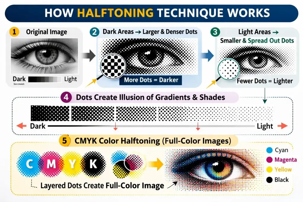
As most printers can only print solid ink, they can’t naturally reproduce continuous shades like a photograph. Halftoning solves this by breaking an image into thousands of small dots of different sizes and spacing.
Halftoning technique is a reprographic process that converts a design into hundreds or sometimes thousands of tiny dots. These tiny dots make a print more flexible and soft.
When you look at those dots up close, you can clearly see them. But when viewed from a normal distance, your eye blends them and views them as smooth, continuous tones, just like a real photograph.
In addition to this, halftoning reduces ink usage, offers faster production times, and efficient prints.
How Halftoning Works?
Instead of printing a smooth fade like a digital image, the printer prints tiny dots.
Here’s how:
- Dark areas of an image are represented by larger or more densely packed dots.
- Light areas are represented by smaller or more spread-out dots.
- The spacing and size of dots fool the human eye into seeing gradients and shades.
- Most halftoning uses CMYK colors (Cyan, Magenta, Yellow, Black), layering dot patterns of each color to reproduce a full-color image.
Why Every DTF Print Needs Halftoning?
If you have a custom clothing brand, print-on-demand shop, or a heat transfer business, understanding halftones can make a huge difference for your business. That’s what separates basic prints from high-quality, professional print results.
In DTF (Direct-to-Film) printing, halftoning is crucial because:
- DTF printers work with CMYK + White ink, which means they can only print solid ink drops, not truly mixed colors.
- So, to recreate skin tones, shadows, and gradients, the RIP software uses halftone dot patterns.
- The human eye “blends” these dots from a viewing distance, perceiving smooth color transitions.
- Poor halftoning = visible banding, muddy tones, and wasted ink.
When Halftoning Done Right, It Can:
Make DTF Transfers Better
If you’ve ever touched a DTF transfer and it felt stiff or plasticky, it means too much solid ink is deposited while printing. Using the halftoning technique distributes the ink in tiny dots instead of solid blocks or areas, preventing too much saturation on the transfer film.
Softer, More Flexible Hand Feel
When a design covers less surface area with ink, the fabric underneath stays soft and flexible. Halftone patterns reduce how much ink sits on top of the fabric, so your finished garment doesn’t feel stiff upon touching.
Better Fabric Breathability
The less ink, the more of the fabric’s natural texture comes through. Air can pass through more easily, which makes the garment more comfortable to wear, especially for items like t-shirts or activewear that sit close to the skin.
Long-lasting Designs
The more ink you put on fabric, the more likely it is to crack or peel after repeated washing. By using less ink overall, halftone patterns help your design stay intact and look sharp for longer.
Detailed & Sharp Prints
Halftones make it possible to reproduce complex artwork, photographs, and fine details in DTF printing. Without them, photographic images or designs with subtle shading would look flat or blocky.

How to Set Up Halftoning for DTF Prints?
Creating Halftone effects may sound complex, but most professional design software and tools like Kixxl make it fairly easy to set up.
Kixxl, the gang sheet builder, is designed specifically to make your entire DTF workflow faster, more accurate, and production-ready. Instead of manually adjusting artwork for print, it helps you prepare designs efficiently, optimizes layout, resolution, and print settings in one place.
Halftoning is one of kixxl’s powerful features. It allows you to automatically convert gradients and solid colors into precise dot patterns suitable for DTF printing. The results:
- Smooth gradients
- Better ink control
- Cleaner white underbase
- Reduced color banding
- Print-ready files without complicated manual setup
Here’s how to Create Halftones with Kixxl:
- Log in to Kixxl and access the Kixxl editor. There, upload your artwork (preferably 300 DPI, transparent background). Also, you can choose from Kixxl’s image library.
- Drag your design onto the gang sheet canvas. Click the “Halftone Image” button on the right side of the menu bar.
- A new tab will open that includes different options to halftone the image. Such as halftone type, pattern, and pattern size. You can select and adjust them accordingly.
- You can select a background color and opt for the Knockout Color option, too.
- Click the “Generate Halftone” button, and you’ll have a halftoned image generated.
- Click “Save and replace on canvas” to replace the original image on canvas with this new halftoned version.
- Moreover, if you select “Add to Images,” the halftoned version will be added to the “Uploaded Images” section in the editor.
- Export in the required format (PNG/PDF, depending on your printer workflow).
- Send to RIP software for final print processing.
5 Common Halftoning Mistakes in DTF Printing and their Fixes
1. Using Dot Sizes That Are Too Small
Very tiny dots may look smooth on screen, but won’t print properly. They can disappear, break apart, or clog with ink.
The Fix:
- Avoid extremely small dot sizes.
- Test your printer’s minimum printable dot size.
- Slightly increase the dot size for better consistency.
2. Setting Wrong Frequency (LPI)
Higher frequency doesn’t always mean better quality. Using very high frequency (too many dots) can cause muddy prints or loss of detail.
The Fix:
- Use a balanced frequency suitable for DTF
- Test different LPI settings to see what your printer handles best.
3. Ignoring White Underbase Halftoning
Applying halftones only to colors but keeping a solid white underbase can make prints feel heavy and look harsh. A smooth color needs a smooth white underneath.
The Fix:
- Halftone the white underbase too (especially for gradients).
- Reduce white density for a softer hand feel.
4. Incorrect Halftone Angle
Using incorrect or the same angles for multiple colors can create unwanted patterns.
The Fix:
- Adjust halftone angles slightly between colors.
- Test print to check for pattern interference.
5. Using Semi-Transparent Pixels Instead of True Halftones
If you use soft gradients or transparent areas in your design without turning them into halftones, the print won’t come out clean. The ink may be patchy or uneven.
DTF printing works best with solid dots. Soft or semi-transparent pixels don’t print correctly and can ruin the final result.
The Fix:
- Always convert gradients and transparent areas into halftone dots before printing.
- Don’t rely on opacity or soft edges to create shading.
- Use a halftone tool or your DTF printer’s RIP software to make proper halftones.
Final Thoughts
Halftoning may be invisible to the naked eye and seems like a subtle part of the printing process, but it’s literally a game-changer for DTF printing.
By converting gradients and shades into precise dot patterns, halftoning ensures your prints are sharp, vibrant, and professional every time. Without it, the design can appear patchy or inconsistent.
Frequently asked questions
If you have any unanswered questions, feel free to contact our support team via email. We’ll get back to you promptly to provide assistance.
- Without halftoning, designs with gradients or soft color transitions may print as harsh color blocks. This can result in poor color blending and lower-quality transfers.
-
Common halftone patterns include round dots, elliptical dots, and line patterns. Round dots are typically preferred for DTF printing because they produce smoother gradients and consistent ink coverage.
-
Beginners should use the right halftone pattern, proper resolution, and suitable LPI settings. Testing small prints before full production also helps ensure optimal results.