Key Takeaways
- Always use a printer-specific ICC profile loaded into your RIP software, never a generic one.
- White ink is what makes your colors pop on dark fabric. If you don’t set it up correctly, even the most beautiful design will come out with weird white edges or faded patches.
- Using a basic print driver can ruin color consistency. One should use RIP software as it controls everything, from CMYK conversion to white ink generation.
- Besides saving film, a gang sheet builder like Kixxl also protects your color quality when designs are packed poorly on a sheet, colors bleed into each other, and ink spreads unevenly.
Introduction
Color management in DTF printing is the process of controlling, calibrating, and standardizing how colors are captured, processed, and reproduced on transfer film. It ensures that the final print on fabric matches the original digital design as closely as possible.
Color shifts are common in DTF printing because ink reacts differently based on factors like the film used and the fabric it’s pressed onto. For example, a bright red in your design could print as dull orange on fabric. A vivid teal could come out muddy.
Color management ensures what you see on screen is close to what you get in your hands.

Why Does Color Management Matter in DTF Printing?
Color management matters in DTF printing because inconsistent colors lead to wasted materials, and a damaged brand reputation. Moreover, it is one of the factors that either makes the customer a loyal one or leads to a refund request.
Here's why color can go wrong in DTF and why you need to manage it consistently:
- Monitor vs. print discrepancy: Your monitor uses RGB (Red, Green, Blue) light-based colors while printers use CMYK ink (cyan, magenta, yellow, and black). If not managed properly, the colors will shift.
- Ink behavior on film: DTF inks interact with PET film and fabric differently than a digital display, which may cause saturation and hue shifts.
- White ink underbase: The white ink layer underneath your colors significantly affects how vivid or dull the final print will look.
- Fabric type: Cotton, polyester, and blends absorb inks differently, changing how colors appear after pressing.
- Temperature: Inaccurate heat-press temperature can cause colors to fade or over-saturate during transfer.

What Are the Key Components of DTF Color Management?
DTF color management has five core components and each of them plays a specific role. However, neglecting any one of them can throw off your entire color workflow.
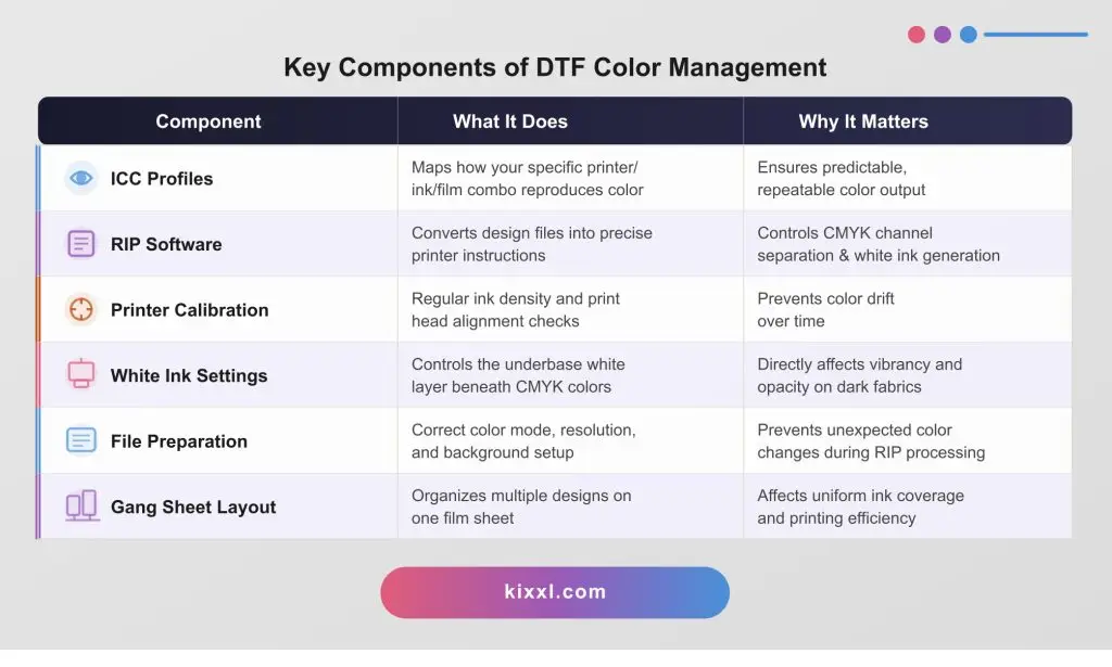
How Do ICC Profiles Work in DTF Printing?
An ICC (International Color Consortium) profile in DTF printing is a file that instructs your software on how to optimize the interaction between your specific printer, ink, and film to accurately reproduce colors, allowing it to auto-correct any color discrepancies before printing.
Think of an ICC profile like a translator between your design software and your printer. Your screen speaks RGB. Your DTF printer speaks CMYK. The ICC profile instructs both devices on how to translate colors, ensuring they are as close as possible.
Types of ICC Profiles You Need in DTF:
- Input Profile: Describes the color space of your source file (usually sRGB or Adobe RGB)
- Output Profile: Describes your printer’s specific color reproduction, unique to your printer model, ink brand, and film type.
- Display Profile: Calibrates your monitor so what you see matches what you’ll print.
What Role Does RIP Software Play in DTF Color Management?
RIP (Raster Image Processing) software is the engine of DTF color management. It’s a software that sits between your design and your printer, ensuring that the printer gets exact, precise instructions about what to print.
Without RIP software, you’re relying on your operating system’s basic print driver, which cannot handle the complexity of DTF printing, especially white ink generation and color channel control.
How Does White Ink Affect Color Output in DTF Printing?
White ink in DTF printing acts as the underbase layer that makes all other colors visible, especially on dark fabrics. Without it, CMYK colors would be nearly transparent on anything other than white garments.
The amount, density, and coverage of your white ink layer directly determine how realistic your final print looks
You Need to Control these White Ink Settings:
- White Ink Density (%): Higher density = more opaque background = more vivid colors, but also, it requires more ink and longer drying time. Typical range: 80–100% for dark fabrics.
- White Ink Mode: “Full White” (solid coverage), “Choke White” (slightly smaller than the CMYK layer to prevent white edges showing), or “Knockout White” (no white behind CMYK areas). For most garments, Choke White is the standard choice.
- White Ink Pass Count: More passes build a thicker, more opaque layer. Usually 2–3 passes on dark fabrics.
- Halftone White: For designs with gradients that fade to transparent, the white ink should fade too; you’ll get a harsh visible edge.
What Are the Most Common DTF Color Problems and How to Fix Them?
The most common DTF color problems include faded colors after pressing, color shifting between screen and print, banding in gradients, and visible white ink edges. Each has a specific cause, but it can be fixed.
Problem | Cause | Fix |
Faded colors post-press | Heat too high or press time too long — burns ink | Lower temperature to 160–170°C; press for 10–15 sec |
Colors look different from screen | No ICC profile or monitor not calibrated | Install printer ICC profile; calibrate monitor with a colorimeter |
Visible white ink “halo” | White ink not set to “choke” mode | Enable Choke White in RIP (typically 1–2 mm choke) |
Banding or stripes in print | Clogged print heads | Run nozzle check and head cleaning cycle; check ink flow |
Muddy, dull colors | Incorrect color mode (CMYK converted in Photoshop) | Send files as sRGB and let RIP handle CMYK conversion |
Colors vary between print runs | No printer calibration routine | Run printer calibration print (G7 or custom density chart) weekly |
Colors bleed into each other | Insufficient spacing on gang sheet | Maintain 0.25″+ spacing; use gang sheet builder with auto-spacing |
Dark fabric colors look washed out | Insufficient white ink underbase | Increase white ink density to 90–100%; check white ink expiry |
How Does a Gang Sheet Builder Improve Color Management in DTF printing?
In DTF printing, color management is about making sure the colors you see on screen match the final print.
With traditional software like Photoshop or manual RIP setups, you are handling ICC profiles, color settings, and adjustments yourself, which can lead to mistakes and inconsistent results.
A gang sheet builder simplifies this process by automating color handling and using pre-optimized settings for printing, so designs stay more consistent across different prints. Also, it reduces human error and helps maintain accurate colors while you focus more on layout and saving material rather than technical color corrections.
Here’s how an AI-powered Gang sheet builder automates color consistency in printing workflows:
- Analyzes color density: the AI algorithms identifies designs with heavy ink coverage and distributes them across the sheet to prevent local ink overload.
- White ink mapping: The AI groups designs with similar white ink requirements together, keeping the white layer consistent and predictable across the entire sheet.
- Automates bleed and spacing: the AI enforces correct spacing rules to prevent color bleed between adjacent designs.
- Batch processing: upload hundreds of designs at once; the AI builds optimized sheets automatically saving you hours of manual work each day.
- Preview and color proofing: AI gang sheet tools like Kixxl include a live preview that simulates how colors will appear post-print, based on your printer’s ICC profile.
Top 6 Best Practices to Achieve Perfect DTF Color Every Time
To get perfect color in your DTF prints always, you need a consistent workflow that includes:
- Calibrate your monitor monthly using a hardware colorimeter. An uncalibrated monitor is the single most overlooked cause of screen-to-print color mismatch.
- Use printer-specific ICC profiles from your ink supplier. Update them whenever you change ink brand, film brand, or RIP software version.
- Always prepare files in sRGB at 300 DPI minimum. Do not flatten layers or convert to CMYK manually before sending to RIP.
- Set up a RIP color workflow: assign source profile (sRGB), output profile (your printer ICC), and rendering intent (Perceptual for photos; Relative Colorimetric for graphics).
- Print a color test chart weekly on your DTF printer. Compare it to your reference chart to catch color drift early before it affects customer orders.
- Use a gang sheet builder, preferably an AI-powered one that arranges your designs. Proper layout ensures ink density is balanced and colors don’t bleed between designs.
- Document your settings for every successful color profile setup. Record heat press temperature, time, and pressure for each fabric type so you can reproduce results consistently.
Frequently asked questions
If you have any unanswered questions, feel free to contact our support team via email. We’ll get back to you promptly to provide assistance.
The most important factor is using the correct ICC profile for your specific printer, ink, and film combination — loaded into your RIP software. Without an accurate ICC profile, no amount of design skill or expensive equipment will consistently produce accurate colors.
DTF prints look different on dark vs. light fabrics because of the white ink under-base. Light fabrics act as a natural base, so colors appear brighter. On dark fabrics, weak or missing white ink lets the fabric show through, making colors look dull.
A full color calibration should be done weekly for high-volume shops, or whenever you change ink, film, or environmental conditions (humidity and temperature affect ink behavior). If you notice color drift between batches, that’s a signal to recalibrate immediately.